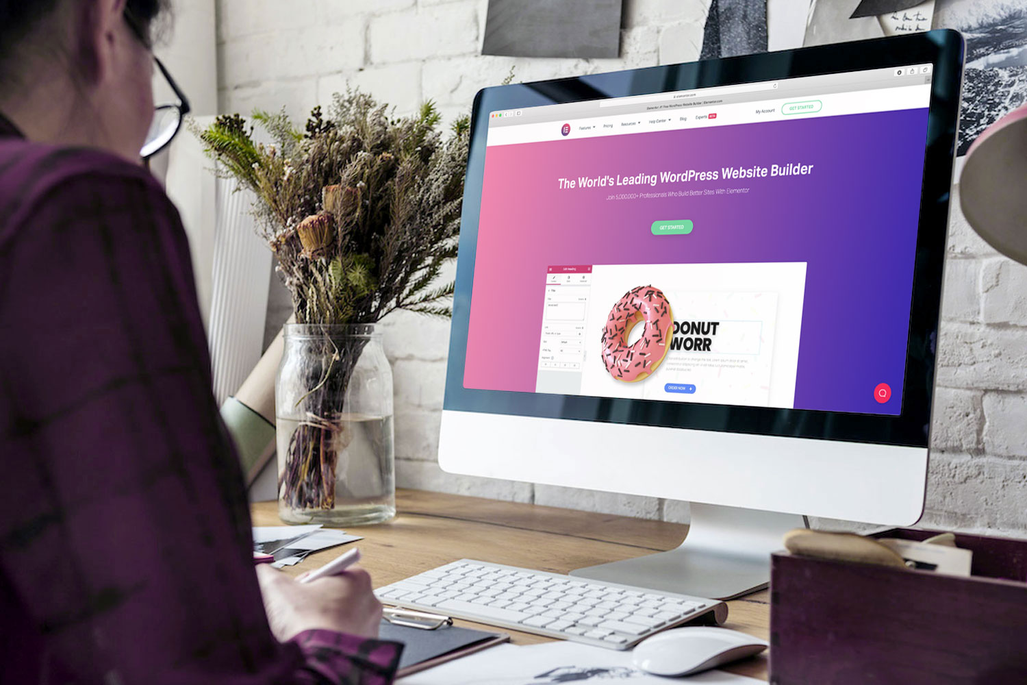
We are constantly developing new UX Templates for Elementor Template Library to facilitate your web development.
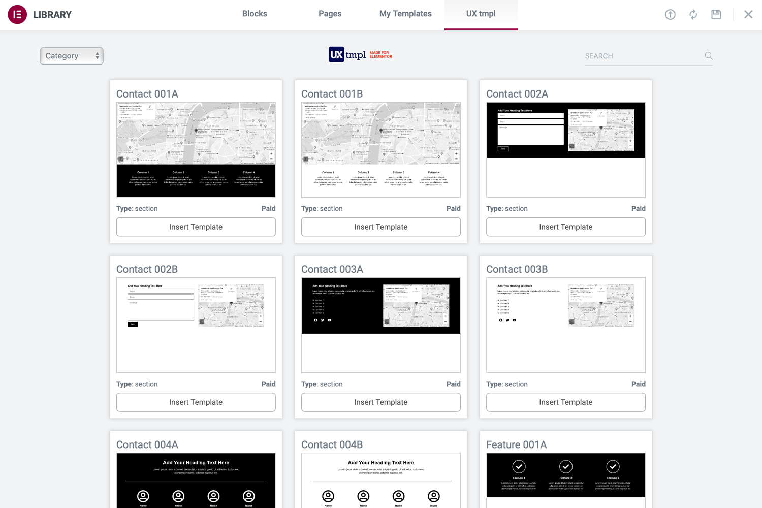
Premade Sections
All UX templates are complete with all the modules needed for that particular section. This way you save time and easily build a page with different premade sections. Start by selecting a Header, then maybe a Hero section followed by Feauture and different Layout sections and then finish with a Footer section. You can create wireframes easily and quickly to show your customer before you apply the UI design.
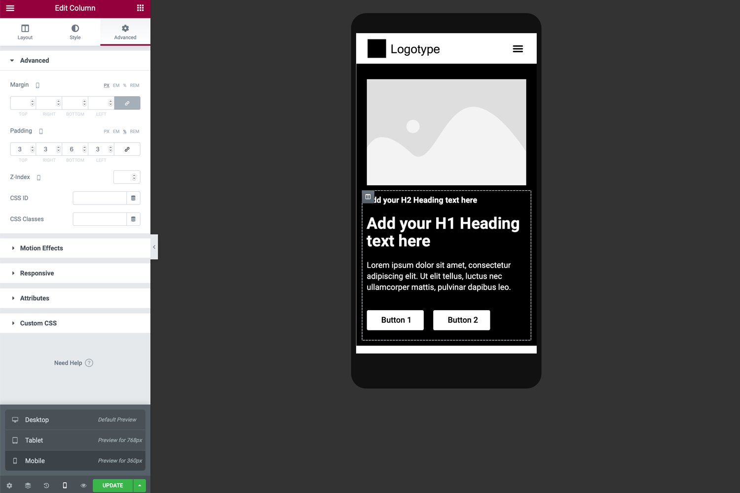
Preconfigured Settings
All UX templates are designed according to mobile first approach. We mainly use units of measure such as em, rem, vw, vh and % before the static unit px (pixels) for even better responsive webdesign. You can also easily shift columns from right to left or reversed for even better flexibility. With preconfigured settings you can create both UX design and UI design much faster.
How to use it
In this movie we show how easy it is to put together a landing page using our UX templates. Download and install our free plugin, register for PRO and activate your license. Then just get started. Everything is preset such as margins and padding for the best possible mobile and responsive experience. It could not be faster and easier to develop with WordPress and Elementor, the tools we love the most.
Support us and get discount!
Early Access Deal
Now when we go live, we have 135+ templates but are constantly adding new templates and more services. Please support us during this startup process and claim your offer to get yourself a discount for life. Thanks!
EARLY ACCESS DEAL
0% OFF
Claim your offer with the coupon code below. Offer is only valid until 31th of december 2020.